Cash Flow Graphics: How to Visualize Your Money Movement
Learn how to create cash flow graphics that reveal your spending patterns. Discover the best chart types, tools, and techniques to visualize your money.
I stared at my bank statement for twenty minutes last month, trying to figure out where $800 had disappeared. The numbers were all there—dozens of transactions, deposits, withdrawals—but my brain couldn't piece together the story. That's when I realized I needed cash flow graphics, not just raw data.
Turns out, our brains process visual information 60,000 times faster than text. When you're trying to understand money movement, a well-designed chart does in seconds what spreadsheet scrolling takes hours to accomplish. And honestly? It's the difference between knowing you overspent and actually seeing the pattern that caused it.
What Are Cash Flow Graphics and Why Do They Matter?
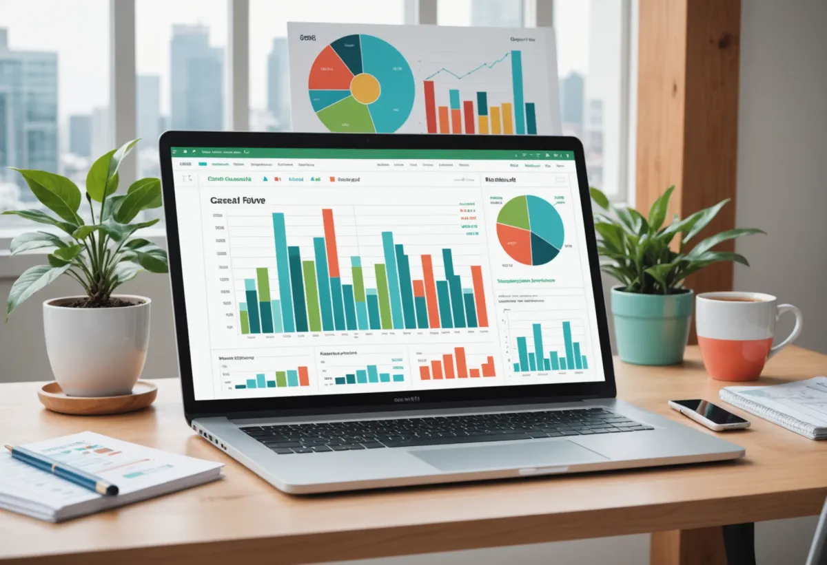
Cash flow graphics are visual representations of money moving in and out of your accounts over time. Think bar charts showing income vs. expenses, line graphs tracking your balance trajectory, or Sankey diagrams illustrating exactly where each dollar flows.
Here's why they're not just pretty pictures:
Pattern recognition becomes automatic. When I switched from reviewing transaction lists to looking at cash flow charts, I immediately spotted that my spending spiked every third week of the month. Turns out that's when I was stress-shopping after difficult work deadlines. Never would've caught that in a spreadsheet.
Anomalies jump out. A sudden dip in your balance line or an unusually tall expense bar demands attention. Your brain flags it before you even consciously process what happened.
Motivation increases. There's something deeply satisfying about watching a savings line trend upward or seeing your expense bars shrink month over month. Numbers alone don't trigger that same emotional response.
The real power of cash flow graphics isn't sophistication—it's clarity. Even a simple bar chart comparing this month's spending to last month's tells you more at a glance than any transaction log.
How Do You Create Effective Cash Flow Graphics?
You don't need to be a data visualization expert. You need to pick the right chart type for what you're trying to understand.
The Income vs. Expense Bar Chart
This is your foundation. Two bars per month—one for total income, one for total expenses. Green and red work well because they're intuitive. When the red bar exceeds the green bar, you've got a problem. Simple as that.
I track this monthly and quarterly. Monthly shows me the immediate picture. Quarterly smooths out one-time expenses (like that car repair in March) and reveals the underlying trend.
The Balance Line Graph
Plot your account balance daily or weekly over time. This creates a visual story of your financial trajectory. A healthy graph trends upward, even if there are dips. A concerning graph shows a consistent downward slope or wild swings.
Pro tip: Add a horizontal line at your minimum comfortable balance—whatever amount makes you feel secure. It becomes your visual floor, and you'll notice immediately when you're getting too close.
The Category Breakdown Pie Chart
Yeah, pie charts get a bad rap in data circles, but for personal finance they work. Seeing that 40% of your spending goes to housing and 25% to food gives you immediate context. When one slice dominates unexpectedly, you know where to investigate.
I prefer donut charts (pie charts with the center cut out) because you can put your total spending number in the middle. Combines the visual breakdown with the hard number.
The Sankey Diagram
This is the advanced move. Sankey diagrams show flows—money coming in from various sources on the left, moving through your accounts in the middle, and flowing out to different expense categories on the right. The width of each flow represents the amount.
They're gorgeous when done right, and they tell the complete story of your money movement in a single image. Creating them manually is tedious, but tools like SankeyMATIC (free) make it manageable.
Best Tools for Creating Cash Flow Graphics
You've got options at every skill level and budget.
Spreadsheet Solutions
Google Sheets and Excel both have decent charting built in. If you're already tracking your finances in a spreadsheet—maybe using a Google Sheets family budget template—you can generate basic charts directly from your data.
The process: select your data range, insert chart, choose chart type, customize colors. It's not fancy, but it works. The main limitation is that you have to manually update your data, and the charts won't automatically reflect new transactions.
Dedicated Finance Apps
Most cash flow apps now include built-in visualization. The advantage here is automation—they pull your transactions and generate graphics without you lifting a finger. The disadvantage is you're limited to whatever visualizations they've built.
Look for apps that offer: - Customizable date ranges - Category-level breakdowns - Trend comparisons (this month vs. last month, this year vs. last year) - Export options if you want to use the data elsewhere
Specialized Visualization Tools
If you want full control over your cash flow graphics, tools like Tableau Public (free), Power BI, or even Canva's chart maker let you build exactly what you envision. The tradeoff is time—you'll spend hours learning the tool and manually importing data.
For most people, I recommend starting with whatever your finance app provides, then graduating to spreadsheet charts when you want something specific, and only going full visualization-nerd if you genuinely enjoy the process.
What Should Your Cash Flow Graphics Actually Show?
Here's where most people mess up: they create graphics without knowing what question they're trying to answer.
Before building any visualization, ask yourself: what do I need to understand?
"Am I spending more than I earn?" → Income vs. Expense comparison (bar chart or simple line graph)
"Where is my money going?" → Category breakdown (pie/donut chart or stacked bar chart)
"Is my financial situation improving?" → Balance over time (line graph with trendline)
"What's causing my cash flow problems?" → Detailed flow analysis (Sankey diagram or waterfall chart)
"How does this month compare to my average?" → Benchmark comparison (bar chart with average line)
I've found that three graphics cover 90% of my needs: a monthly income vs. expense comparison, a rolling 12-month balance trend, and a quarterly category breakdown. Everything else is nice-to-have.
One thing that's helped me is using KlutterAI to automatically categorize transactions before I visualize them. Garbage data makes garbage graphics, and having clean categories means my pie charts actually make sense instead of having a massive "Uncategorized" slice.
Common Cash Flow Graphic Mistakes to Avoid
I've made all of these. Learn from my suffering.
Too Many Categories
A pie chart with 15 slices is useless. Your brain can't process that many segments meaningfully. Group smaller categories into "Other" and keep your main chart to 6-8 categories max. You can always drill down into "Other" with a separate chart if needed.
Inconsistent Time Periods
Comparing January (31 days) to February (28 days) without adjusting for the difference skews your perception. Either use consistent periods or normalize to daily averages. This matters more than you'd think—a 10% spending increase might just be three extra days.
Ignoring Irregular Expenses
That annual insurance premium or semi-annual car registration will create massive spikes that make your other data hard to read. Consider creating separate graphics for regular expenses and one-time/irregular expenses. Understanding what flexible expenses are helps you categorize these correctly.
No Context or Benchmarks
A bar showing $2,000 in restaurant spending means nothing without context. Is that normal? Is it up or down? Add comparison lines—your average, your budget target, or your previous period. Context transforms data into insight.
Over-Designing
3D charts, gradient fills, decorative elements—they look impressive but often obscure the actual data. The best cash flow graphics are clean and boring. Save the creativity for something that isn't trying to communicate financial truth.
How to Read Your Cash Flow Graphics Like a Pro
Creating graphics is step one. Extracting meaning is where the value lives.
Look for trends, not individual points. One bad month doesn't define your finances. Three bad months in a row? That's a pattern requiring action.
Question the outliers. When something looks weird—a huge spike or unexpected dip—dig into the underlying transactions. Sometimes it's a data error. Sometimes it's a forgotten expense. Sometimes it's a genuine problem.
Compare deliberately. Month-over-month shows recent changes. Year-over-year shows seasonal patterns. Both matter. That high December spending might look alarming monthly but perfectly normal annually.
Check your assumptions. I was convinced I spent too much on coffee. My graphics showed food delivery was actually the problem—three times my coffee spending. Visualization doesn't lie, even when it contradicts what you "know."
Frequently Asked Questions
What is the best chart type for showing cash flow?
For most personal finance purposes, a simple bar chart comparing income and expenses works best. It's immediately understandable and highlights the most important question: are you spending more than you earn? For more detailed analysis, line graphs showing balance over time and pie charts breaking down spending categories complement the basic bar chart effectively.
Can I create cash flow graphics in Excel or Google Sheets?
Absolutely. Both Excel and Google Sheets have built-in charting tools that handle basic cash flow visualization well. You'll need to organize your data properly first—typically with dates in one column and amounts in another—then select the data and insert your preferred chart type. The main limitation is manual data entry and updates.
How often should I review my cash flow graphics?
Weekly quick glances and monthly deep reviews work well for most people. Weekly reviews catch problems early—like overspending mid-month—while monthly reviews reveal patterns and trends. Quarterly reviews help you see bigger-picture changes that monthly noise might obscure.
What's the difference between cash flow and profit/loss graphics?
Cash flow graphics show actual money movement—when cash enters and leaves your accounts. Profit/loss (or income statement) graphics show revenue earned and expenses incurred, regardless of when cash changes hands. For personal finance, cash flow graphics are usually more relevant since you need to know if you have money available, not just whether you're theoretically profitable.
Are there free tools for creating cash flow graphics?
Yes, plenty. Google Sheets and LibreOffice Calc are free and handle basic charts. SankeyMATIC creates Sankey diagrams for free. Canva offers free chart templates. Many budgeting apps include visualization features in their free tiers. You don't need to spend money to create effective cash flow graphics.
Making Cash Flow Graphics a Habit
The best visualization is the one you actually look at. I've tried elaborate dashboard setups that I abandoned after two weeks because updating them felt like homework.
Now I keep it simple: three key graphics, auto-generated where possible, reviewed every Sunday morning with my coffee. Takes ten minutes. Keeps me honest about my money.
Start with one chart—income vs. expenses for last month. See what it tells you. Add complexity only when you have specific questions that simple charts can't answer.
Your money tells a story. Cash flow graphics just make that story readable. And once you can actually see what's happening with your finances, making better decisions becomes almost automatic. The patterns are right there, waiting for you to notice them.